
Tuesday 30 December 2008
Monday 29 December 2008
Progress and Influences
After watching 101 Dalmatians I was impressed with the stylised aesthetic (at least for the first half of the film). This got me thinking more seriously about my background artwork, so I'll take this opportunity to briefly collate some of the more important influences.
 101 Dalmatians- i like the cluttered look, the strong composition. Each element in the picture looks as if it could be separate, there's very little texture.
 Childe Hassam The Room of Flowers- has the same cluttered look of 101 but in a more abstract way. The composition is kept interesting by large objects breaking up the page, and the diagonal perspective lines created by the windows.
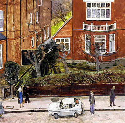 Carel Weight Datsun Cherry- Weight's selective use of perspective gives an interesting look and a naivety to the picture. I like the structure of the houses.
Below are some examples of experimentation in photoshop. Although none of these capture the tone of the film, they're all too light, I like the texture in the second image but a lot of the detail is lost. Ill try for something more subtle, more similar to Childe Hassam.


Friday 26 December 2008

Monday 22 December 2008
Character design concepts part 1
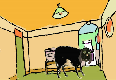
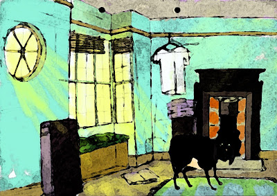
I thought now would be a good time to show the progress of the character designs for the dog. He's the antagonist in my script who enters the man's life and disrupts it by destroying his belongings and generally just being a nuisance. Below is the dog on which my character is based; the most hyperactive, smelly, slobbering dog i know.


Below are a selection of possibly designs, although I'm not happy with any of them. Starting from the top. This is too 'cartoony', it wont fit my aesthetic and also is too reminiscent of Belleville Rendezvous' dog. Below that is probably my favourite of the group, it has a mixture of appeal and a strangeness I'm going for. Finally, this is just a straight drawing of one of my reference pictures, it doesn't have much appeal but is closer to the aesthetic I'm looking for.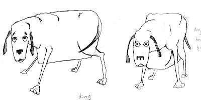

 I don't think any of my designs have really captured the dogs personality, they are all looking a bit old and tired. I'll continue with the concept drawings, working on the face to give him the kind of crazy expression which relates to his character.


Below are a selection of possibly designs, although I'm not happy with any of them. Starting from the top. This is too 'cartoony', it wont fit my aesthetic and also is too reminiscent of Belleville Rendezvous' dog. Below that is probably my favourite of the group, it has a mixture of appeal and a strangeness I'm going for. Finally, this is just a straight drawing of one of my reference pictures, it doesn't have much appeal but is closer to the aesthetic I'm looking for.


 I don't think any of my designs have really captured the dogs personality, they are all looking a bit old and tired. I'll continue with the concept drawings, working on the face to give him the kind of crazy expression which relates to his character.
Friday 12 December 2008
More Influences
This is going to be quite a brief post highlighting two influences to my animation. The first is Dead Leaves (2004). This is an extreme, fast paced Anime; essentially an extended fight scene. The influence i want draw from is the film's creative use of camera angles and extreme perspectives, playing with the medium in a filmic way.

 I want to apply these principles to my film in a more subtle way to suit the tone of the film while still playing with composition. Hopefully making my film visually exciting.
The Second Influence is A Scanner Darkly (2006). This is a rotoscoped film which uses the rotoscoping technique to translate the disorientating nature of the script. For example the perspectives shifts, objects wobble and the drawn detail pulls in and out, corresponding to the main character, Robert Octor's deterioration due to drug use.

 The main point i want to draw from these examples is that i am trying to be creative in the composition and layout. Also that i want to play with the medium visually to some extent.

 I want to apply these principles to my film in a more subtle way to suit the tone of the film while still playing with composition. Hopefully making my film visually exciting.
The Second Influence is A Scanner Darkly (2006). This is a rotoscoped film which uses the rotoscoping technique to translate the disorientating nature of the script. For example the perspectives shifts, objects wobble and the drawn detail pulls in and out, corresponding to the main character, Robert Octor's deterioration due to drug use.


 The main point i want to draw from these examples is that i am trying to be creative in the composition and layout. Also that i want to play with the medium visually to some extent.
Thursday 11 December 2008
Animatic - Second Pass
posting this a little late but o well
I'm quite pleased with the timing throughout. there are some grey areas such as the scene between the man and dog fighting, which i need to roughly plan and key out. other areas need to be tightened up too, as well as the sound fx which in places are quite dodgy.
I think there's going to be quite a drastic change to the soundtrack, i am planning on quite a simple score possibly an original solo instrumental piece tailored to the animation. something that will give my piece an independent feel.
Tuesday 2 December 2008
thinking about Aesthetics

These are some examples of the work of Amedeo Modigliani, an artist i have been looking into as an initial influence on aesthetic. I have decided upon an 'artistic' rather than graphical style for my film's aesthetic, basically meaning uneven lines and textured colours, Modigliani's heavily outlined figures give the possibility of transferring this style to the screen. The figures are very well observed but Modigliani has distorted aspects of them such as noses and necks. Their eyes are also of interest to me, blank and often completely coloured they give an eerie impression. Looking at his work, i am thinking of taking my designs in a direction where the characters are imperfect, creepy, maybe even ugly. Hopefully this will add a dimension to their character.
Here is a quick mock-up in photoshop, attempting something similar to modigliani's style.

Subscribe to:
Posts (Atom)