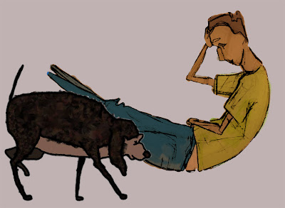
For more information or if you would like a copy of the film please email me at catch_twenty_two@hotmail.com

Tuesday 26 May 2009

All done

Well the films all finished now and it has been an interesting experience. In the last few weeks I have come out of the little sphere of work I had created for myself and realized there is a big world out there and I need to start looking for a job in it. I've also finally finished off a few outstanding issues which I'd ran out of time with before the deadline, so now I'm happy to say I can draw a line under this project.

The film was screened at harbour lights for my degree's end of year show and went down well I hope. It won the award for best aesthetic amongst my graduating year, so I couldn't be more pleased!. I'm now in process of submitting OMAHD to some festivals so hopefully there's still some mileage in the film yet.

Below are some screen shots from the finished Film. Thanks for looking at this blog!

Monday 20 April 2009

Colouring part two


So this is what I've decided upon for my final character aesthetic. I'm using two different techniques but i think they compliment each other.

The basic technique for colouring my man is this;
re-sized raw jpegs, paint over in photoshop on a new layer using a multiply blend. Using this layer to give a solid outline delete the unwanted exterior on the original photo. then duplicate this layer, threshold and overlay on top of the image using multiply to give the defined black lines.

Below is an example of a combination of this technique and finished painted dog frames ( I haven't painted the background yet)


Friday 17 April 2009

Colouring

Its been a while since posting here, that's mainly because Ive been concentrating on getting all the animation sorted and ready for shooting. well that's done now (mostly) so I'm moving onto colouring.

Here is an example of what Ive been doing,


Spot the difference. I have a slight issue over how to blend his fur layer into the final look. Layering it on top gives a nice result but means losing the lineart around his back and ears, multiplying the layer leaves the lineart but the black lines seem a little heavy, not a big issue as i can re-render what i have already once i make a decision. Below are some examples,


This last ones a quick experiment with using a lighter colour line. I'm not too keen.

Friday 27 March 2009

Animatic Update

The latest version of my animatic. The animation is almost complete so I will be moving onto colouring within the start of next week.

This version also includes the latest rough soundtrack provided by composer Lee Miller and the vocals for both man and dog performed by Rory Jackson. This is fairly roughly edit but still I'm really pleased with how the elements are coming together.


Sunday 22 March 2009

a short clip

i though I'd post a little clip to let you know what I've been up too. its been a while since my last post because I've been busy animating! almost finished now!

anyway this is a shot that took me quite a while. its a key scene, which shows the moments before the man snaps. I've gone for a handy cam-stylee approach too imply we're involved in the action and to emphasise the hectic, scatty nature of the dog and hide some of my dodgy animation.


Saturday 21 February 2009

Animatic Update

-this includes most of my recent work and a new soundtrack more in line with what i have in mind. this week i have also been in contact with a voice artist and a composer to get the sound side of things moving.


Tuesday 3 February 2009

latest animatic

...with full sound, unlike the last one. hopefully going to be bringing some of my rough keys into this soon and a new soundtrack. anyway here it is for now,

Friday 23 January 2009

backgrounds... zing!

so im glad to say i have my backgrounds drawn up! was a lot of work but managed to bash them out in just one weekend. still not totally sure about how im gonna paint them yet, but its good to have all my layouts. next thing, start animating!


Monday 19 January 2009

variations


Thought I would quickly share my thoughts on some of the various ways of painting my character. I initially thought of doing my whole cleanup and colouring within photoshop to avoid any issues with alpha channels and also to play with the software a bit to give an original look. I'm having some concerns over the amount of time this will take with my man character so above are some variations using lines painted within photoshop, original line art and no lines at all. its a bit of a headache, but not a particular urgent problem.

update!- below is just an animated test trying to put some of these styles into practice, although they may appear a little crappy on this blog player. I'm feeling the first two styles for their boiling fun look. the lineart on the third is way too heavy but equivalent of what I'm using for the dog. maybe lineart can work but looking at these quick test I'm thinking more towards the messy, suggestive colouring, hoping that the movement will still be readable.

Thursday 15 January 2009

Aesthetic Mock-up


ok this is basically the kind of look I'm going for. the idea is a loose painted style with the lineart fading towards the background. As you can see it is quite a messy picture which is my reaction to the traditional clean and controlled aesthetic of much animation. the background and the texturing on the characters is my attempt to bring a richness into the aesthetic.

this is kind of a compromise between a more abstract painting which lost the lineart detail and a colder 'block colour' style of traditional animation. in this instance the lineart is possibly too light compared with the heavy black lines of the dog, thicker lineart may give a more coherent look but could possibly detract from the animation and make the scene too 'heavy', more tests are needed.

character turn-arounds.


these are the turnarounds i have submitted with my pilot animation. i think they re looking ok but could do with being redrawn a few times to make them more appealing and simplified. also some research into hands and paws is needed

Sunday 11 January 2009

a relevant film


The Cat Come Back, by Cordell Baker, was suggested to me as a similar film.


I think this is a great film, although more comic and 'cartoony' than i was going for, but still it has given me some thoughts on how the male character, Tristan, should react to the dog

Friday 9 January 2009

Concepts - Male Character

I have left the male character in my film for a while now, i have been partly avoiding him and concentrating on the dog because he is the star. However i have eventually started work on designing him. I had the idea of calling him Tristan which is a Greek name related to tragedy, but based on the style of my film- two characters in a confined flat, his name is pretty irrelevant. Anyway just to recap, an initial influence was the artist Modigliani. His portraits have distorted awkward faces and expressions which i think would give my man a distant, 'alien' look as well as complementing my arty aesthetic. This may however pose challenges with character animation and conveying emotion.


Below are some of my initial sketches. As a sad character i have kept him skinny and downcast, but tried to look for ways to give his body some substance.


I feel a lot of these concepts are over designed and also too detailed, as i intent to do the clean up and painting in photoshop. However, i like some off these as starting points, so i will start working with them on the computer to find an appealing and workable design.

A quick colour mock-up,

Friday 2 January 2009

part 4


getting closer...